Professional Tennis Registry
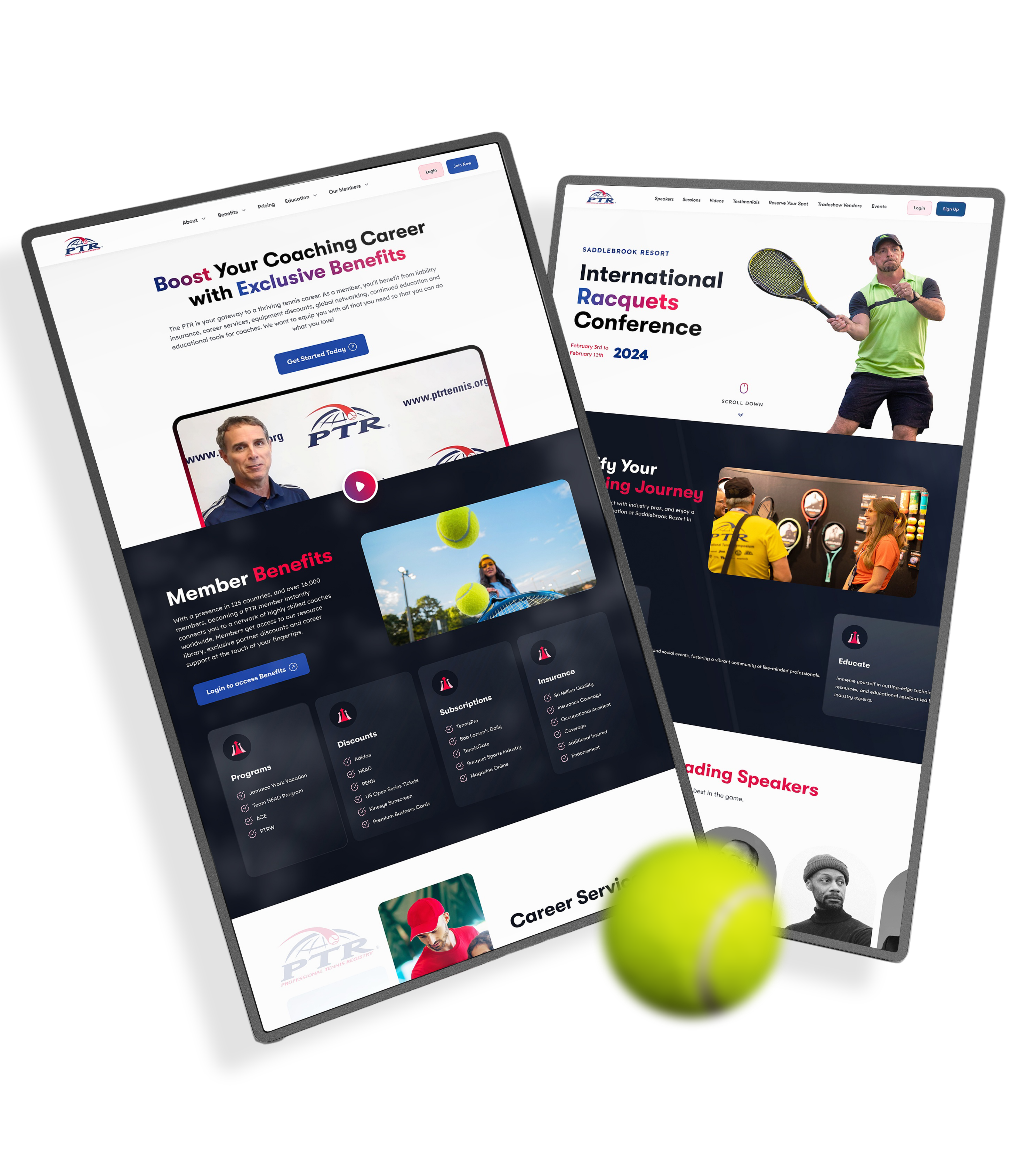
The Professional Tennis Registry (PTR) website is a platform dedicated to educating, certifying, and supporting tennis coaches and racquet sports instructors. It provides members with access to professional development workshops, certification pathways, career resources, and liability insurance
View Live
i myself design a highly disciplined, minimalist layout focused on clean typography, distinct visual hierarchies, & structured content buckets that effortlessly funnel visitors into three clear action tracks: joining the registry, selecting precise educational pathways, and accessing localized member benefits.
My hands-on execution for the PTR project was grounded in a deliberate, multi-phase UX process. I dove deep into the organization’s foundational workflows and carried out extensive user research to map out a clear, frictionless website strategy. This graphic marks the structural pillars of my design journey: mapping complex internal workflows and translating user insights into a cohesive, global digital product.

Visual Overload & Structural Chaos
A chaotic information architecture and dense, fragmented text blocks overwhelmed members, causing massive user anxiety and visual fatigue across the interface. Furthermore, the complex multi-step certification funnel suffered from crippling user drop-offs due to a tedious, friction-heavy registration process. Balancing diverse organizational resources across multiple racquet sports without cluttering the digital ecosystem ultimately posed a monumental UX challenge.
Solution
I synthesized a sophisticated, streamlined design language using bold gradients and high-energy imagery to establish immediate professional calm across the platform. To resolve the onboarding drop-offs, I re-engineered the complex certification pathway into an intuitive, progressive disclosure journey that transforms a daunting funnel into a smooth, frictionless sequence. By structuring a modular visual hierarchy, I converted dense athletic data into a scannable, adaptive interface tailored for members


Visual Harmony
I replaced clinical anxiety with effortless clarity. Utilizing deep blues, crisp whites, and a disciplined typographic grid, I organized complex metabolic metrics into a calm, scannable visual rhythm
Seamless UX
I bridged Meto’s marketing site and web app with borderless precision. By transforming dense medical data into progressive, modular flows, I turned complex health tracking into a trusted, intuitive user journey

More Projects*